Right now, you will hear a lot about Instagram from so many people. With over 800 million active monthly users, this social media app has grown to a great extent. However, IG is nothing without images. Capturing the attention of followers or some potential customers, for business purposes, will not be possible if your account fails to create a beautiful and engaging content out globally. Moreover, stagnant platform is not welcomed. Your source has to be extremely flexible with new updates on a daily basis. It helps people know your point of view and they will realize what to expect once they visit your Instagram profile.
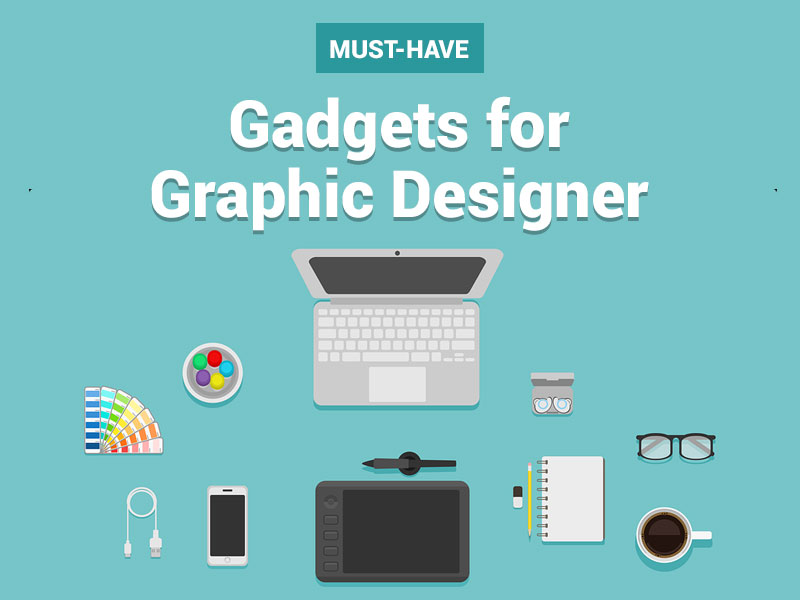
Even when you are actually designing all your posts DIY style and without any help, it is always possible to know more about ways to make designs, for that better post. By working on some of the promising graphic designing tips in mind, you can always feel a lot closer to developing posts that followers might look forward to find in their feeds, on a daily basis.
Your font choice will always matter:
For each post, you have to work your way out and choose a font. That font you plan to choose, will matter quite a lot without your knowledge. Font generally matters quite a bit in case you plan to use typography in posts. Then, the font size, style and color will matter as importantly as the images itself.
- A poor quality font choice makes it rather hard for the customers to take any post seriously. Moreover, you have some of the well-selected font choices as well, designed to drive some engagement and interest to each one of the post.
- For the business owners, it will genuinely take some time to really get more into the posts, to find out which one suit them well. Generally, it is highly advisable to avoid any font like Comic Sans or papyrus, especially when it is about business oriented IG platforms.
- Some of the apps like Font Candy will be able to offer font recommendations. In case, you are planning to create some images with applications like Canva, you have the right to play around with some of the multiple fonts to see the one, working best for you.
- In case, the post seems font heavy considerably, you might have to play around with some of the contrasting forms of font styles.
- Always remember that the size of your selected words along with the tense you put in will definitely help in making a huge and big impression on readers.
Simplicity is always the best:
Previously, the heftiest the designs would have been, the better was the options. But, things have changed drastically over the past couple of years in terms of designs. Now, the notion turned its way from heavy designs to some simpler ones. Simple designs are the ones, which will work best for you. As they always say, less is more often. The team from Gramblast relies on this methodology, and the developers work on this concept only.
In case, the images are completely overloaded with information, it becomes hard for the followers to actually garner what they actually need to get out of the posts in this section. Texting some of the heavy posts will help in benefitting the user by offering multiple white spaces. On the other hand, it is always advisable to minimize the current filters and effects in this regard, as well.
You need to work quite hard, just to make the posts relevant:
It is true to state that your images on Instagram need to be quite relevant to both the type of story you are planning to work with and you are trying to tell. It needs to match up with target audiences, just to help them get more attracted towards your IG business account. Even though, IG account is mostly personal but if you are trying to open a business-centric one, then the account turns out to be more public than personal. You have to create the page keeping this point in mind that the posts are all relevant and should act wisely. Everyone is allowed to come and comment on your posts. So, before opening it up for the audience, you have to deal with its relevancy. A poor post quality makes it hard and confusing for audience to portray your idea thoroughly. So, a clear concept is always welcomed.
- There is always a place and time for creating some of the off-beat posts. However, you have to be sure that every photo you plan to share needs to be somewhat relatable to the goal of your brand, in every post you work on.
- It is always mandatory to create posts, which will help audience understand your photo choice with only minimal context infusion from your part.
Focus on creating emotional response:
Eliciting emotional addition in follower will work great in leaving that lasting impression. The font you are planning to choose along with the colors will help in compromising the images. So, those points matter a lot. Some of the bright colors like yellow and red are widely associated with positive emotions like excitement and jot. On the other hand, some darker colors like gray and blue will reverse the emotional outburst. You have to consider the emotional response you plan to work on and that might affect stylish choices accordingly.
Focusing on contrast and color match:
Trying to create a contrast or matching colors within posts will add more levels of interest among audience, with every post you plan to create or work on. You can try matching the font of your post with background color of image. Contrasting some of the colors and background elements in post helps the elements to stand out in the crowd and addresses a cohesive post.
Make sure to work on these points, just to help get the most out of Instagram with effective forms of graphic designs. If needed, you need to work on color correction a bit more as well.